Moja global's branding
Branding Guidelines
This file hosts the organization's brand assets and guidelines for moja global. We expect contributors and maintainers to follow these guidelines during content promotion, outreach, and communicating contribution efforts.
Title
Moja global is always written in all lower case, except when at the start of a sentence in which case it appears as Moja global. Moja global is written in lower case because open source is also the lower case (even though both are registered trademarks). While there is no published reason why moja global uses lower case, some have explained the use of lower case as a contrast to proper nouns and as an expression of the supportive role moja global tries to fulfill.
Logomarks
Primary logomark
Shown here is the primary Moja Global logomark.
The primary logomark should be used carefully and in most cases in order to uphold clear and consistent communication.
| Description | Image |
|---|---|
| Primary Colorway 1A is to be used in instances where a white/light colored background and/or a light colored image is present. | 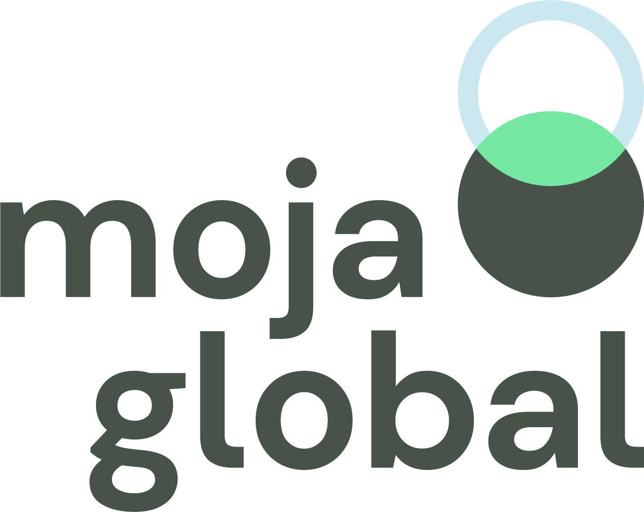 |
| Primary Colorway 1B is to be used in instances where a black/dark colored background and/or a light colored image is present. | 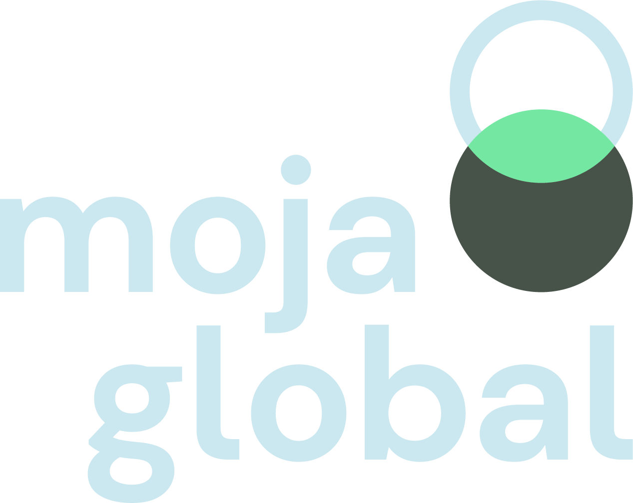 |
Monochromatic usage
Shown here are the monochromatic versions of the primary logomark. They are to be only used in cases where color print is restricted.
| Description | Image |
|---|---|
| Primary Colorway 1A - is to be used in instances where a white/light background is present. | 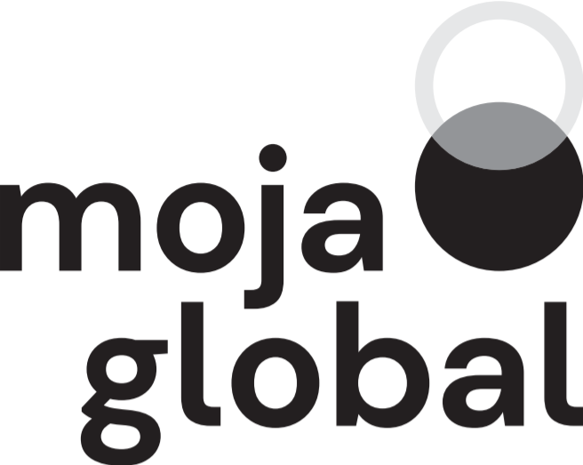 |
| Primary Colorway 1B is to be used in instances where a black/dark background is present. |  |
Secondary logomark
Shown here is the secondary moja global logomark.
The secondary logomark should be used carefully and in cases where the brand graphics are already present on the page.
| Description | Image |
|---|---|
| Secondary Colorway 2A - is to be used in instances where a white/light colored background and/or a light colored image is present. |  |
| Secondary Colorway 2B is to be used in instances where a black/dark colored background and/or a light colored image is present. |  |
Monochromatic usage
Shown here are the monochromatic versions of the primary logomark. They are to be only used in cases where color print is restricted.
| Description | Image |
|---|---|
| Secondary Colorway 2A - is to be used in instances where a white/light background is present. |  |
| Secondary Colorway 2B - is to be used in instances where a black/dark background is present. |  |
Logomark usage
Clear space and sizing
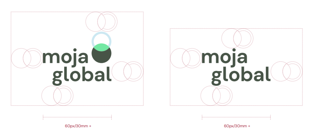
Both the primary and secondary logos should always appear in their entirety, surrounded by a minimum area of clear space, so that headlines, text or other visual elements do not encroach on the logo. The minimum clear space is shown using the height of the brand icon. Logos should be used at a minimum size of 60px or 30mm (w).
Logomark misuse
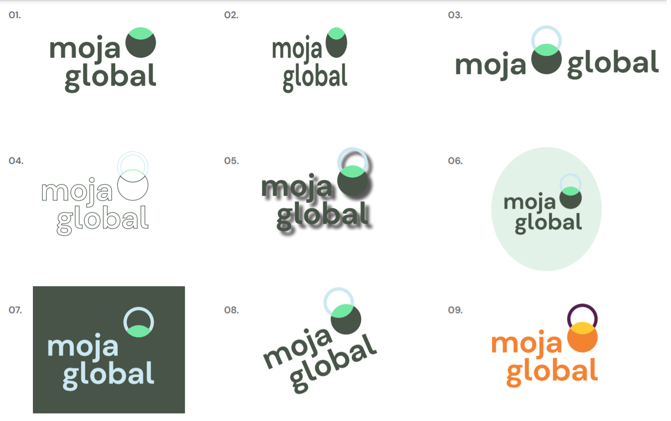
Take care to maintain the integrity of the logomark. The rules demonstrated here apply to all versions of logos.
Do not:
- Do not remove any asset of the logo
- Do not distort or skew the logo
- Do not modify the composition or its proportions
- Do not outline the typography or icon
- Do not add drop shadow/filters
- Do not frame the logo
- Do not use the logo on a background colour that renders any part of logo illegible.
- Do not angle the logo 09. Do not use the logo in an unspecified colour
Graphic elements
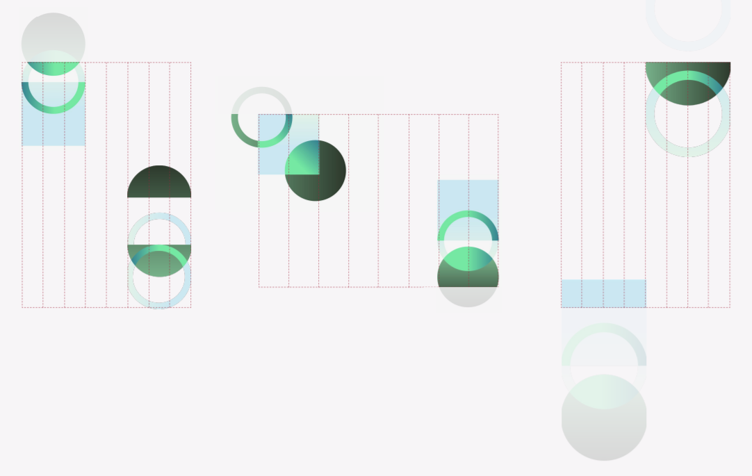
A suite of brand graphics are the ore of the Moja Global visual system and collectively work to represent the pillars of the brand: collaboration, innovation, flexibility and accessibility.
Shapes combine and overlap in various configurations, whilst a bright pop of 'collaboration green' is used to highlight where shapes overlay, signifying the power of collaboration.

Graphic Gradients
In application, graphics further suggest these values through the merging and collaborating of color through gradients.
These graphics can be used on their own as symbolism or together to interact with other content.

Placement and usage
In application, an 8-column grid should be used and graphics should be applied at a 2-column, 3-column, or 4-column scale.
Graphics can be placed liberally to accommodate other content and can be used fully or partially on the page.
Example application: outdoor marketing

Typography
Typographic Families
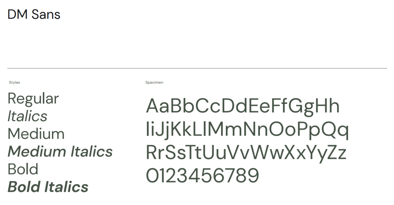
DM Sans is a low-contrast geometric sans serif design, chosen for it's legibility and approachable rounded forms.
It is a free font commissioned by Google from Colophon, an international and award-winning type foundry based in London (UK) and Los Angeles (US)
Typographic Hierarchy
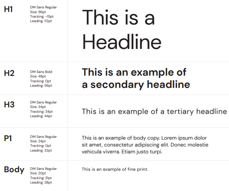
Hierarchy of text is important in a design because it allows the reader to understand, at a glance, the order of importance of the information at hand.
This page exemplifies the sizing and proportions of various styles of text.
Color
Color Palette
The brand colors communicate earth and the natural environment whilst celebrating the innovation of the FLINT software and collaborative spirit of the community.
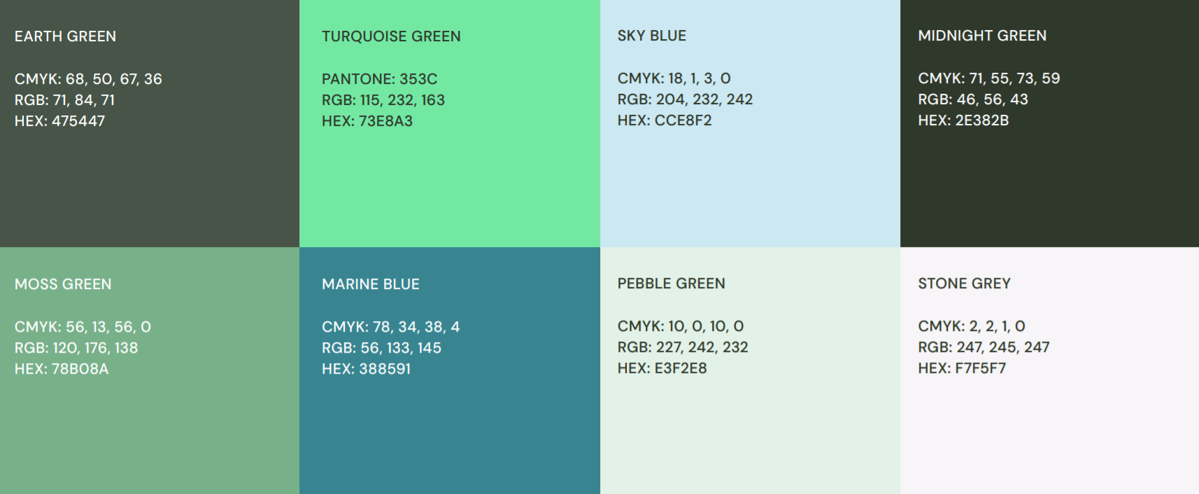
Color Gradients
Color gradients represent the power of collaboration and can be used in application as background colours and as seen in the brand graphics.

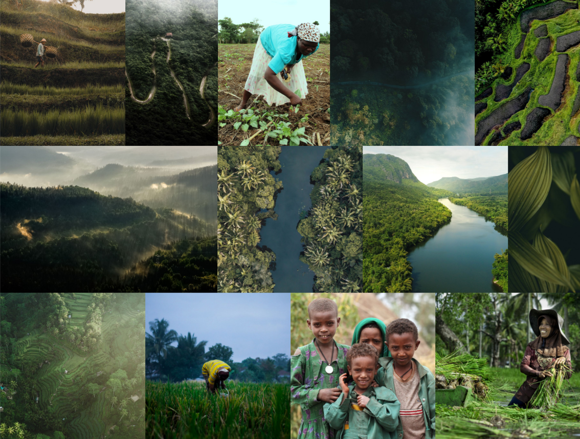
Imagery
Imagery follows the similar richness and nature focus as the brand color palette with subject matter comprised of aerial landscape and macro photography in key regions, diversity and human interaction with nature.
Example applications
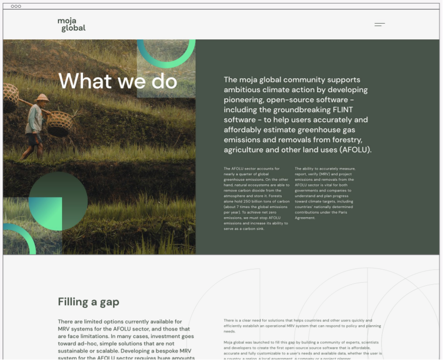
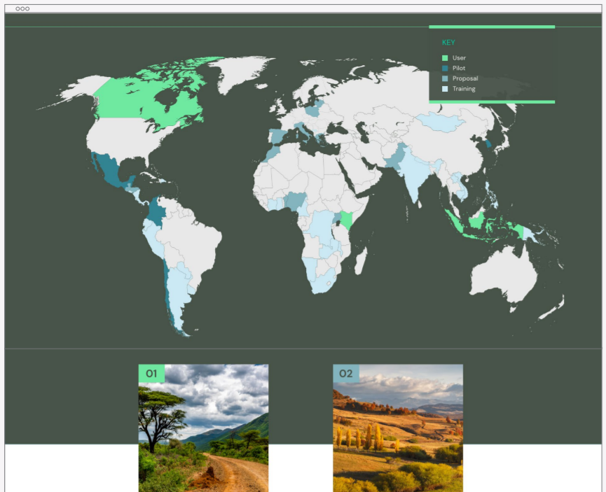
Website
Outdoor Marketing

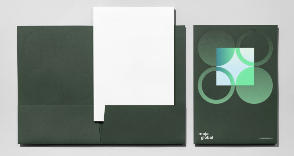
Printed Stationery
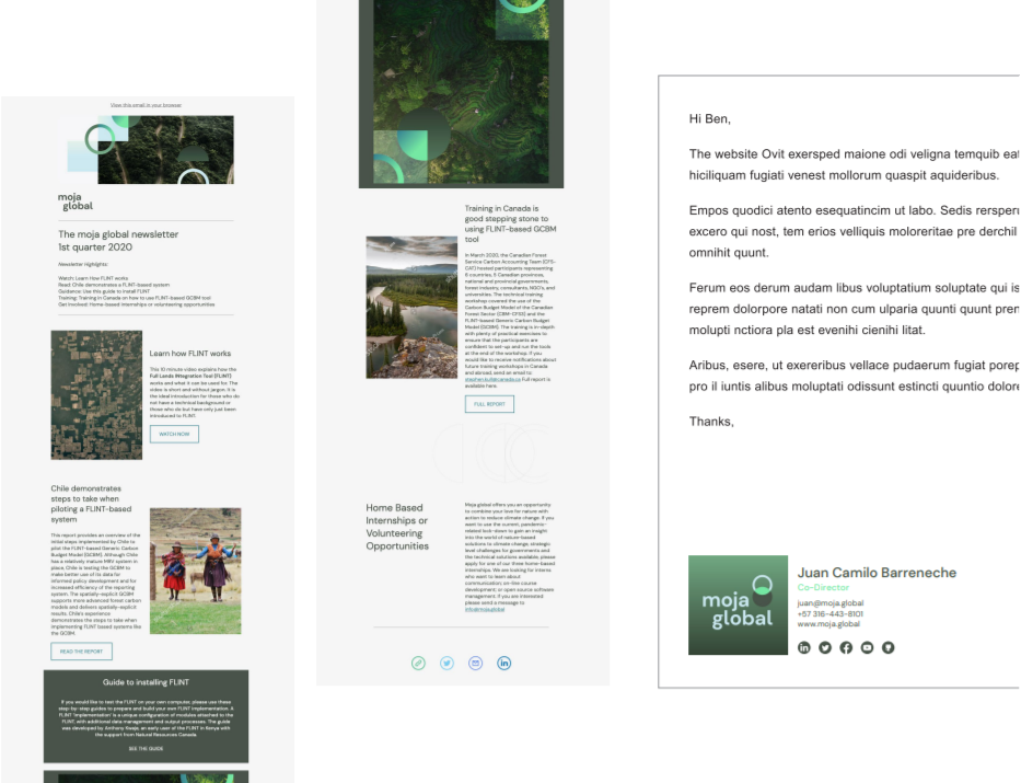
Digital Correspondence
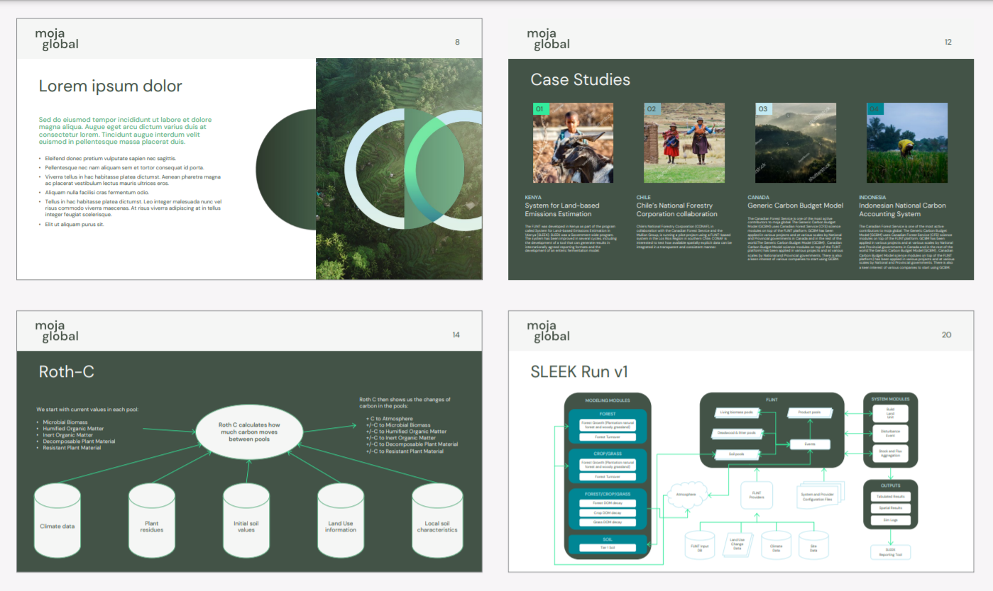
Presentations and Data visualizations
Social Media and Training Platforms
